ShopDreamUp AI ArtDreamUp
Deviation Actions
Suggested Deviants
Suggested Collections
You Might Like…
Featured in Groups
Description
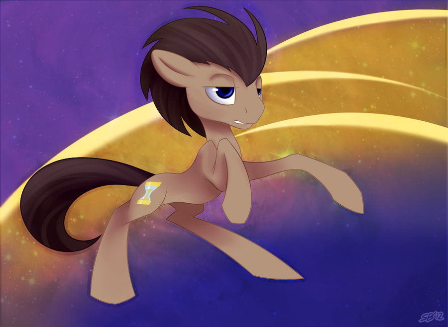
This was originally going to be a lineless piece (sort of along the lines of this) but that didn't work out so I ended up adding the lines back in.
I really need to do a non-abstract background sometime.
I really need to do a non-abstract background sometime.
Image size
1000x731px 708.07 KB
© 2012 - 2024 sbshouseofpancakes
Comments19
Join the community to add your comment. Already a deviant? Log In
Disclaimer: I'm not really an artist in any sense, but I do fancy myself a critic (along the lines of: those who can't do; teach and those who can't teach; criticize), so here we go.
Vision: Your art has always had a strong "realistic" component, so for you to attempt a more flat, lineless piece is actually quite novel, even if you admit you weren't quite able to do it. I presume the choice of subject in this piece (Doctor Whooves, or whatever you want to call him) is more or less arbitrary, as this was more of an exercise than anything else). That being your goal (ie, concentrating on the subject), the more abstract background allows you to do just that.
Originality: Well, it's a pony, it's the doctor, etc. Art is never really original by itself, only in its context. In this case, I would say that this is perhaps not your typical subject or style, and typically the Doctor doesn't get the "Art" treatment very often within the fandom, it's usually the more iconic (or unusual if you will) characters, and let us face it, the Doctor, aside from the whole fanon, is as plain as they come. So it's a refreshing depiction, to be quite honest.
Technique: You can do lineless painting very well when you concentrate on the realistic/naturalistic kind of painting (your Apple Horse is amazing), but given that you provided us with a handy reference, here are a few things you might want to do better next time. Let us look at your reference image: the pose is "simpler" in that it's essentially profile. There is very little foreshortening, which is something you're dealing with here and which brings us to the next point.
Your shading is very nuanced and subtle, but if you look at your reference, it looks more like the artist there worked with gradients on flat planes, rather that 3-dimensional rendered volumes (in this piece you're uncomfortably somewhere in between). This of course becomes even more difficult when the pose is 3/4. You actually did this quite well with the right set of limbs, but the inherent difficulty of flatter shading in this pose is probably what forced you to bring back the lines (stronger contrasts also help).
The inherent difficulties of the pose aside, I do agree with some of the comments that the expression is rather bland, and I think it might have something to do with the eyelids (I scrolled down while writing this...).
The background, while abstract, should perhaps be toned down (less saturated and lighter) if you wish to experiment with this style.
Impact: It's a lovely piece, even if it's not your best work and it fall short simply because you didn't quite achieve what you set out to do.
That being said, it's great to see someone of your calibre trying to experiment with a new style, even though you could simply produce works within your own comfort zone and people would still love them. Perhaps when trying out different styles, you might want to start simpler, and then gradually work up.
I wish you all the best in your future endeavours.


